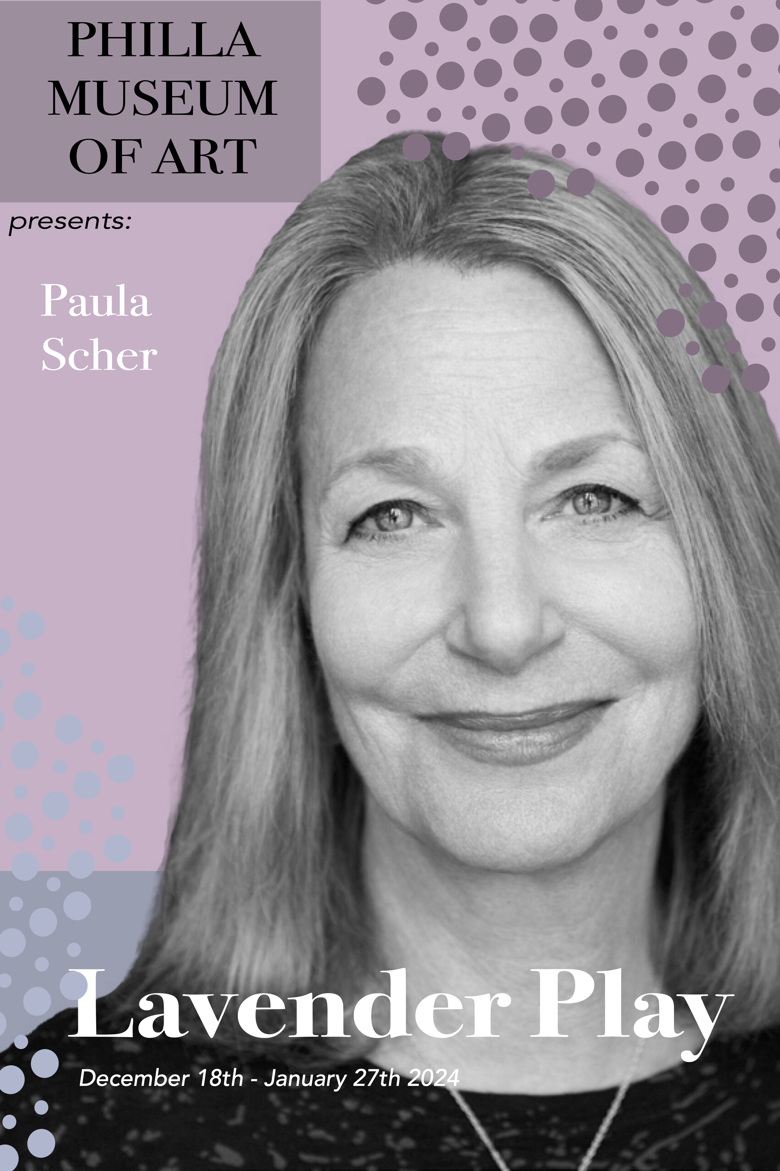
Project Overview
For this project, I created a fictitious brochure design for a Paula Scher art exhibition at the Philadelphia Museum of Art. The design draws inspiration from Scher’s iconic typographic style while maintaining the museum’s prestigious identity. It also focuses on her incredible hand painted maps as the focus of the “Lavender Play” exhibition.
Design Approach
The brochure cover features bold, experimental typography that pays homage to Paula Scher’s distinctive design language. I carefully selected typefaces and compositions that reflect her influential work in the design industry, while ensuring the piece remained functional and engaging for museum visitors.
Typography & Layout
The design employs a dynamic hierarchy of type sizes and weights, creating visual interest and movement across the page. The layout balances artistic expression as shown in the brochure’s patterns. The typogrophy provides clear communication, ensuring that essential information about the exhibition remains easily accessible.
Color & Visual Elements
The color pallet I chose was inspired by Paula’s trade mark saying “Art is serious play” I chose Lavender, periwinkle and light blues as the tones and shades in this piece to enhance the viewers feelings of the artist’s prominent but also soft designs
Tools & Techniques
This project was created using Adobe InDesign, Photoshop, and Illustrator, with careful attention to typographic details and print production requirements. The final design demonstrates my ability to honor an artist’s aesthetic while creating an original piece that serves its intended purpose effectively.